01 Aug 2018
The excellent NUX7 conference takes place later this year in Manchester - http://2018.nuxconf.uk/.
One of the key aspects I try to get across when discussing UX with people is that it’s not just one role for a single (or team) of UX professionals in any organisation. One of the key aims in UX is bringing it in as part of wider business processes. As the Government Digital Services Team often point out, UX is a team sport.
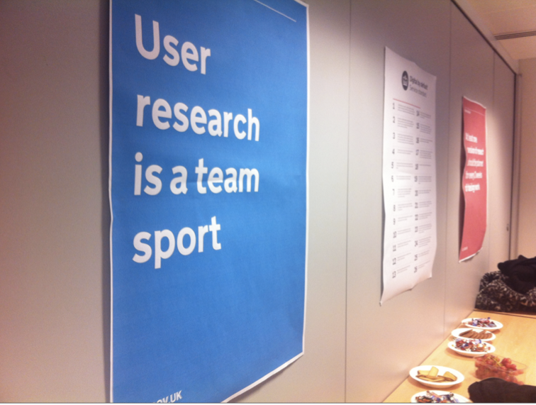 User Research is a Team Sport via http://www.disambiguity.com/strategy-is-being-on-message/
As part of this, it feels that events like NUX7 really benefit when attended by people who don’t class themselves as UX professionals. People who come from others areas of business who are looking to get an idea of how UX fits into these wider processes. More and more businesses are understanding that UX is not something that can be tacked on to the end of a project, instead it needs to be a foundation, underpinning all aspects of a project.
Along with a great line up featuring speakers who have worked with LinkedIn, The New York times, The Belfast School of Art, Confer Health & more NUX7 is a welcoming and open conference for anyone interested in how people actually use systems, apps, websites & products.
As a Project Manager, visit NUX7 and find out how UX can fit into Agile & Lean development processes.
As a Business Analyst, come along to NUX7 to see how UX can dig into the user needs of a business.
As a Developer, experience NUX7 and gain a better understanding how UX design thinking can shorten development time and build on consistent, usable patterns.
An open conference suitable for PMs, BAs, Devs, Managers, Analytics Experts & more to offer a better understanding of what UX is and what it can offer any business.
If your role involves working with people in any way, you will benefit from attending, and hopefully enjoying NUX7.
Tickets
Tickets for NUX7 are available here;
http://2018.nuxconf.uk/tickets/
With discounts for both students and groups of more then 5.
I’m looking forward to seeing a range of people, from all areas of all type of businesses at NUX7.
This post is an update to the one I wrote back in 2015 for the NUX4 Conference - https://electronicpress.co.uk/2015/10/06/nux4-conference-for-teams.html ツ
22 Jun 2018
I was recently given the opportunity to return to York to speak at the second DotYork 🔀 NUX crossover event.
This post acts as a round-up of useful typography resources & links from aspects mentioned during my talk.
Table of Contents
- The Adana Letterpress
- Design Guidelines
- Alignment
- Line Length
- Repetition
- Font Pairing
- Contrast
- Proximity
- Balance
- Grid Systems
- Baseline Grid/Vertical Rhythm
- Vincent Connare
- Creating Your Own Font
- Further Reading
- On-line
- Print
- In Conclusion
The Adana 8x5
The letterpress I spoke of in my talk was the British made Adana 8x5
http://britishletterpress.co.uk/presses/small-presses/adana/
http://britishletterpress.co.uk/presses/small-presses/adana/the-adana-8-x-5/
Caslon - current home of the Adana letterpress
Design Guidelines
The 5 key design guidelines, which align with useful typographic guidelines were;
- Alignment
- Repetition
- Contrast
- Proximity
- Balance
This article - https://maddisondesigns.com/2009/03/the-5-basic-principles-of-design/ - offers a useful overview of these 5 Basic Principles Of Design.
Alignment
The research completed by Microsoft I mentioned during the talk on how people read copy, and therefore interact with typography, online can be found here in their article The Science of Word Recognition - https://docs.microsoft.com/en-us/typography/develop/word-recognition
Line Length
Further information on defining an optimal line-length for your users can be found in these articles.
https://baymard.com/blog/line-length-readability
https://designshack.net/articles/typography/the-importance-of-designing-for-readability/
Repitition
Font Pairing
A useful intro to combining fonts can be found here;
A Beginner’s Guide to Pairing Fonts
These are some great example sites showing font pairing in action;
http://femmebot.github.io/google-type/
https://www.typewolf.com/
https://beautifulwebtype.com
http://typespiration.com/
https://justmytype.co/
https://typ.io/
And these following tools can be used to create and test your own font combinations;
https://www.fontpair.co/
https://www.canva.com/font-combinations/
https://www.typotheque.com/fonts/combinator/latin
https://typekit.com/
And in this area, Fonts In Use is a really useful site to look at real-world examples of both font combinations and individual fonts in place;
https://fontsinuse.com/
Contrast
The following online tool is really useful for quick checking of typographic contrast;
https://webaim.org/resources/contrastchecker/
And this page rounds up other solutions in this area;
http://www.webaxe.org/color-contrast-tools/
If making use of Sketch App for your UI design, the Stark plugin has proved to be the best I’ve found for checking contrast of text;
https://sketchapphub.com/resource/stark/
Information on the Chrome DevTools browser integration can be found here;
https://developers.google.com/web/updates/2018/01/devtools#contrast
Proximity
The following resource offers a useful overview of proximity in regard to design with a specific focus on use in typography;
https://www.sitepoint.com/principles-of-design-proximity/
Balance
Grid Systems
There is so much written about the use of grid systems in design, and in particular how they apply to typography but this is a useful starting point for research;
http://thegridsystem.net/tags/typography/
The classic 📙 book Thinking With Type also offers some useful information in this area;
http://thinkingwithtype.com/grid/
Baseline Grid
In regard to the vertical rhythm of typography, look towards information like the following on baseline grids;
http://typecast.com/blog/4-simple-steps-to-vertical-rhythm
https://builttoadapt.io/8-point-grid-vertical-rhythm-90d05ad95032
Vincent Connare
Information on the Typographer & Designer Vincent Connare can be found here;
https://en.wikipedia.org/wiki/Vincent_Connare
http://www.connare.com/
https://twitter.com/VincentConnare
Creating Your Own Font
There a loads of useful tools available to experiment with creating your own font of examining other people’s.
Fontstruct is a great on-line, block-based font creation tool;
https://fontstruct.com/
As is FontArk;
http://fontark.net/farkwp/
For Desktop based tools, the open source FontForge has always been the classic font/typeface design tool;
https://fontforge.github.io/
FontLab Studio is more an industry standard, but a more expensive solution;
https://www.fontlab.com/font-editor/fontlab-studio/
And Glyphs is the middle-ground between these two options;
https://glyphsapp.com/
Further Reading
On-line
Butterick’s Practical Typography
http://practicaltypography.com/

An excellent resource by Matthew Butterick (https://twitter.com/mbutterick) who also created the legal specific http://typographyforlawyers.com/ resource. Practical Typography offers an excellent overview of typographic theory and is an excellent starting point for learning more about this area.
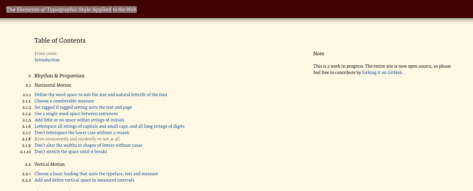
The Elements of Typographic Style Applied to the Web
http://webtypography.net/toc/

A web–specific version of the excellent Elements of Typographic Style book maintained by Richard Rutter. Very useful overview and intro to the more in–depth and non web–specific original.
Print
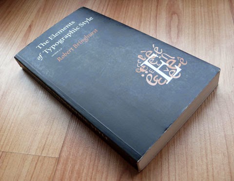
The Elements of Typographic Style
one of the best investments I can recommend when it come to learning typography is to purchase a copy of Robert Bringhurst’s Elements of Typographic Style (http://amzn.to/1itePlL)

For a lighter overview of typographic history and use take a look at Simon Garfield’s Just My Type (https://amzn.to/2yCVIck)
In Conclusion
Thank very much to all who attended my talk on UX & Typography
It hopefully offered some useful tips that can be applied to general product design work.
If you’d like to discuss more, or have any questions in this area, I can often be found discussing this topic on-line.
https://twitter.com/search?q=typography+from%3Awhitingx
Thanks ツ
11 May 2018
There are some great documentary films, and more recently series (https://www.netflix.com/gb/title/80057883), about Design. But 2 things I have noticed about these are that;
- The same Design related films tend to be promoted across different (http://www.designers.watch/) resources (https://www.uxseattle.org/movies/)
- These films tend to have a US focus, both in subject matter and creation.
As such, I’ve been looking at films that focus at the great Design history here in the UK, both at a general level and on ones that focus on specific, British Designers.
📽 UK Design Documentary Films
Abram Games - Maximum Meaning, Minimum Means
“A film of the life and work of Abram Games features rare archive conversations with Games, interviews with his family and assessments today’s leading designers. All aspects of Games’s is explored from posters to product design.”
https://www.abramgames.com/dvd
📺 UK Design Documentary Series
The Brits Who Designed the Modern World
BBC Arts profiles ten great living British designers … to find out what inspires them to make such phenomenal objects. She reveals how designers have responded to society’s evolving tastes, from the brash 60s modernism of Margaret Calvert’s road signs through to the colourful technology of Rick Dickinson’s ZX Spectrum.
https://www.imdb.com/title/tt6278580/?ref_=ttpl_pl_tt
https://www.bbc.co.uk/programmes/b084flz2
The Genius of Design
This five-part series, made by the team behind the award-winning series The Genius of Photography, tells the story of design from the Industrial Revolution through 20s modernism, the swinging 60s, the designer 80s and up to the present day.
https://www.imdb.com/title/tt1729601/
https://www.bbc.co.uk/programmes/b00sdb8x
🗣 UK Design Talks
Matthew Carter - My Life in Typefaces
In this charming talk, the man behind typefaces such as Verdana, Georgia and Bell Centennial (designed just for phone books – remember them?), takes us on a spin through a career focused on the very last pixel of each letter of a font.
https://www.ted.com/talks/matthew_carter_my_life_in_typefaces
I’m hoping this resource will expand out over time so if you have any suggestions, let me know, I’m always happy to hear about new Design films ツ
30 Apr 2018
So you have a product.
 Product A
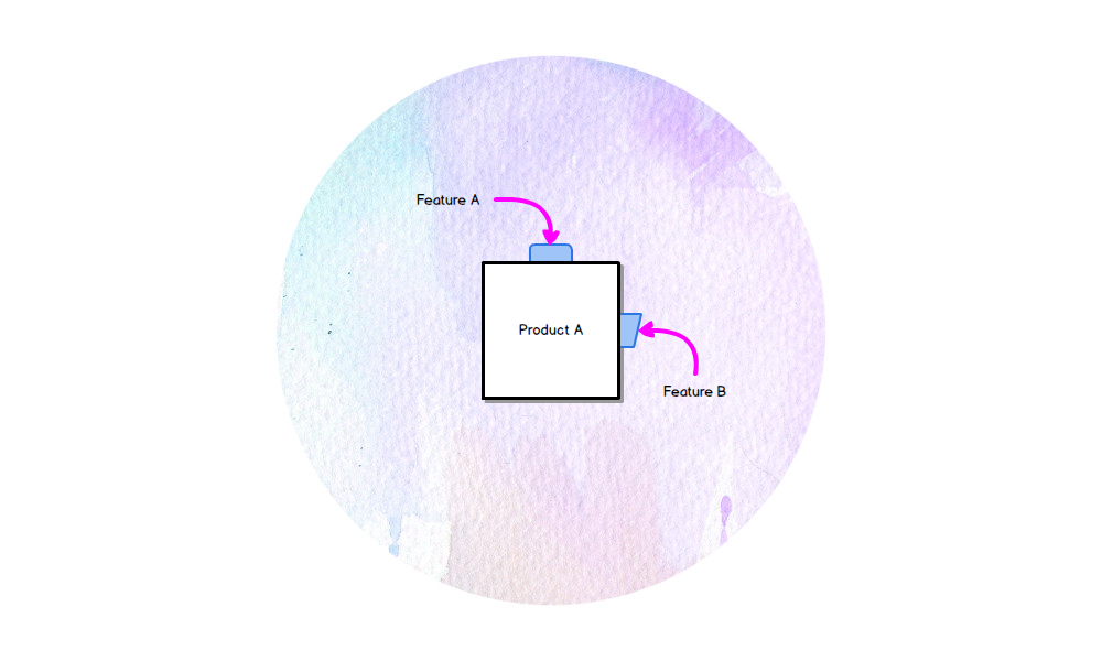
And your product has features.
 Product A - Features
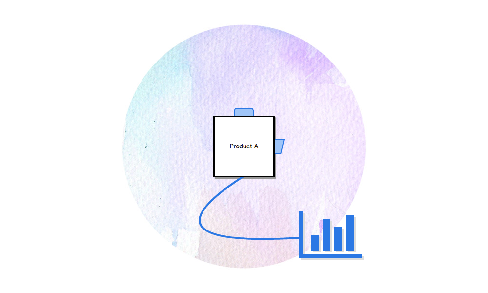
And you have analytics on your product, to see who is using your features.
 Product A - Analytics
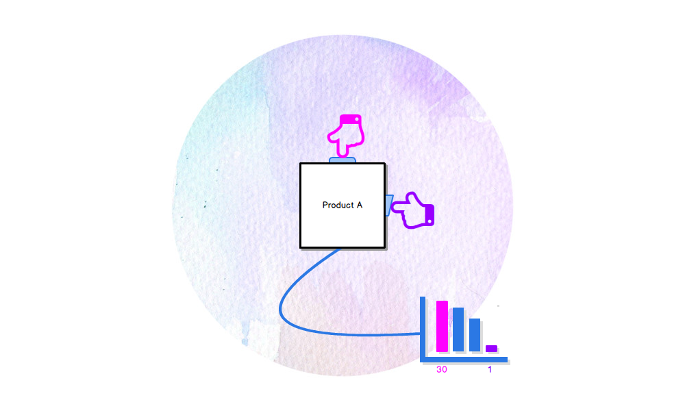
Your analytics show you that, out of the 50 people who use your product 30 use feature A and only 1 uses feature B
 Product A - Analytics Detail
Great you think, let’s focus on Feature A, Feature B is a distraction (our analytics show us). Remove that, and we can be a Feature A focused team.
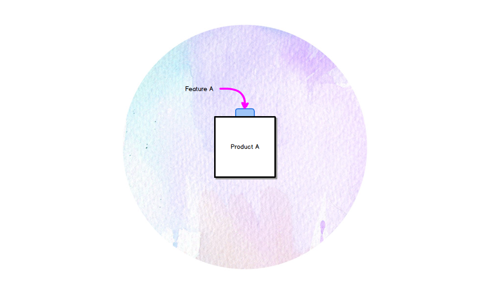
So you remove Feature B.
 Product A - Feature
But what you missed, what your analytics didn’t show you, is the 1 person who used Feature B was the person who chose the product. And, while using Feature A benefited each individual who interacted with it, this 1 key person using Feature B benefitted the whole team.
And you removed Feature B - because your analytics told you to - and you didn’t actually speak to your users to find out what the key people, the influencers actually used.
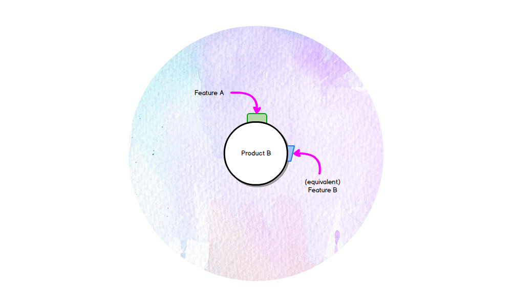
So this 1 person, who used feature B and has now lost it, finds another product, one that still includes an equivalent Feature B. And the whole team move over to that.
 Product B
What do your analytics show now.
 Lost Users, Lost Revenue
 User Research is a Team Sport via http://www.disambiguity.com/strategy-is-being-on-message/