DotYork/NUX Crossover Event - UX & Typography
22 Jun 2018I was recently given the opportunity to return to York to speak at the second DotYork 🔀 NUX crossover event.
Good to welcome @whitingx back for another #dotyork #nux event. Looking forward to his talk on the ux of typography content. Valuable lessons aplenty.
— Dot York (@Dot_York) 21 June 2018
This post acts as a round-up of useful typography resources & links from aspects mentioned during my talk.
Table of Contents
- The Adana Letterpress
- Design Guidelines
- Vincent Connare
- Creating Your Own Font
- Further Reading
- In Conclusion
The Adana 8x5
The letterpress I spoke of in my talk was the British made Adana 8x5
http://britishletterpress.co.uk/presses/small-presses/adana/
http://britishletterpress.co.uk/presses/small-presses/adana/the-adana-8-x-5/
Caslon - current home of the Adana letterpress
Design Guidelines
The 5 key design guidelines, which align with useful typographic guidelines were;
- Alignment
- Repetition
- Contrast
- Proximity
- Balance
This article - https://maddisondesigns.com/2009/03/the-5-basic-principles-of-design/ - offers a useful overview of these 5 Basic Principles Of Design.
Alignment
The research completed by Microsoft I mentioned during the talk on how people read copy, and therefore interact with typography, online can be found here in their article The Science of Word Recognition - https://docs.microsoft.com/en-us/typography/develop/word-recognition
Line Length
Further information on defining an optimal line-length for your users can be found in these articles.
https://baymard.com/blog/line-length-readability
https://designshack.net/articles/typography/the-importance-of-designing-for-readability/
Repitition
Font Pairing
A useful intro to combining fonts can be found here;
A Beginner’s Guide to Pairing Fonts
These are some great example sites showing font pairing in action;
http://femmebot.github.io/google-type/
And these following tools can be used to create and test your own font combinations;
https://www.canva.com/font-combinations/
https://www.typotheque.com/fonts/combinator/latin
And in this area, Fonts In Use is a really useful site to look at real-world examples of both font combinations and individual fonts in place;
Contrast
The following online tool is really useful for quick checking of typographic contrast;
https://webaim.org/resources/contrastchecker/
And this page rounds up other solutions in this area;
http://www.webaxe.org/color-contrast-tools/
If making use of Sketch App for your UI design, the Stark plugin has proved to be the best I’ve found for checking contrast of text;
https://sketchapphub.com/resource/stark/
Information on the Chrome DevTools browser integration can be found here;
https://developers.google.com/web/updates/2018/01/devtools#contrast
Proximity
The following resource offers a useful overview of proximity in regard to design with a specific focus on use in typography;
https://www.sitepoint.com/principles-of-design-proximity/
Balance
Grid Systems
There is so much written about the use of grid systems in design, and in particular how they apply to typography but this is a useful starting point for research;
http://thegridsystem.net/tags/typography/
The classic 📙 book Thinking With Type also offers some useful information in this area;
http://thinkingwithtype.com/grid/
Baseline Grid
In regard to the vertical rhythm of typography, look towards information like the following on baseline grids;
http://typecast.com/blog/4-simple-steps-to-vertical-rhythm
https://builttoadapt.io/8-point-grid-vertical-rhythm-90d05ad95032
Vincent Connare
Information on the Typographer & Designer Vincent Connare can be found here;
https://en.wikipedia.org/wiki/Vincent_Connare
https://twitter.com/VincentConnare
Creating Your Own Font
There a loads of useful tools available to experiment with creating your own font of examining other people’s.
Fontstruct is a great on-line, block-based font creation tool;
As is FontArk;
For Desktop based tools, the open source FontForge has always been the classic font/typeface design tool;
FontLab Studio is more an industry standard, but a more expensive solution;
https://www.fontlab.com/font-editor/fontlab-studio/
And Glyphs is the middle-ground between these two options;
Further Reading
On-line
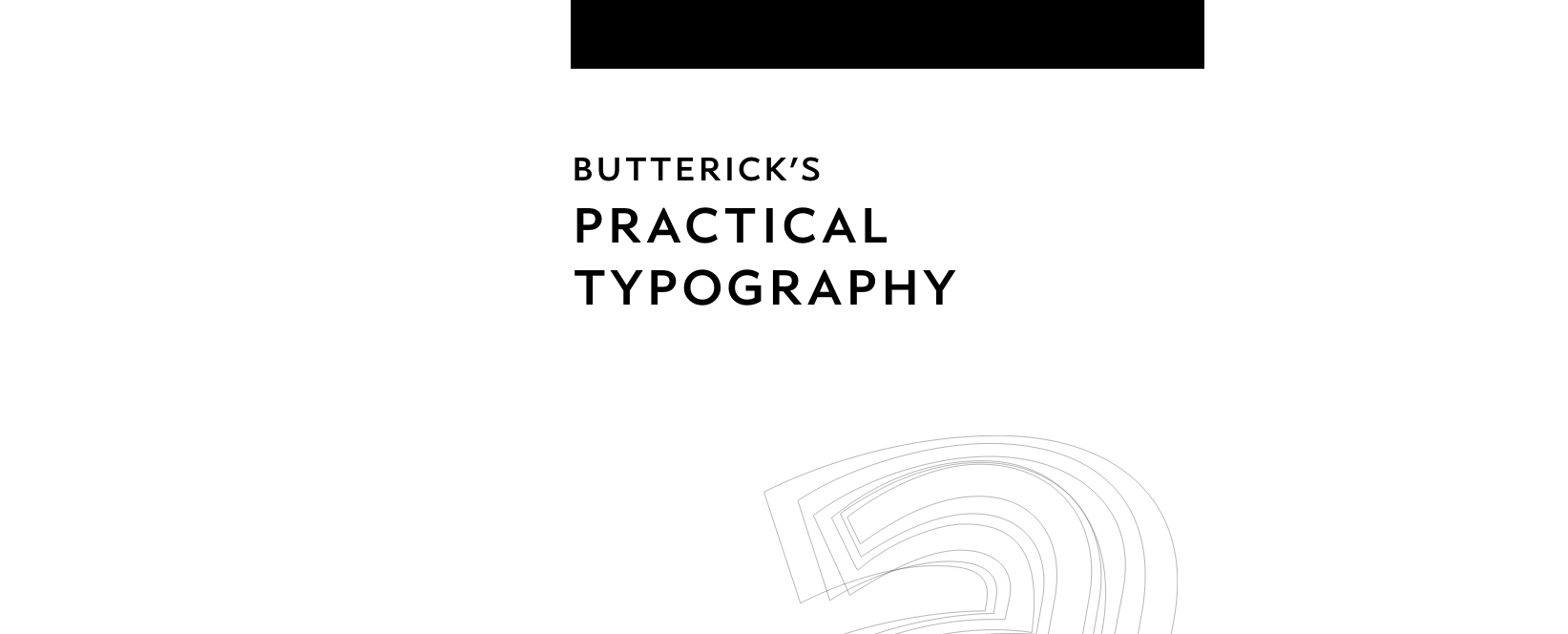
Butterick’s Practical Typography
http://practicaltypography.com/

An excellent resource by Matthew Butterick (https://twitter.com/mbutterick) who also created the legal specific http://typographyforlawyers.com/ resource. Practical Typography offers an excellent overview of typographic theory and is an excellent starting point for learning more about this area.
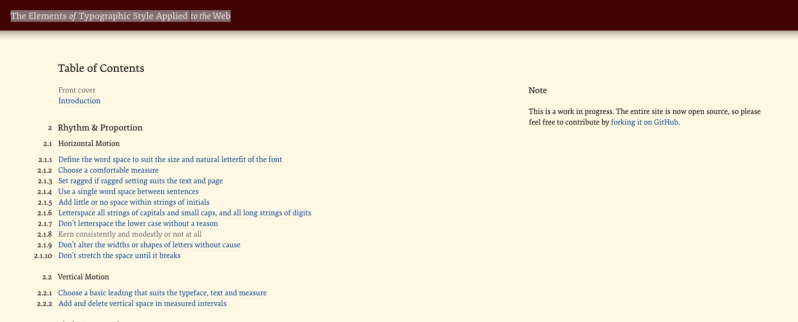
The Elements of Typographic Style Applied to the Web

A web–specific version of the excellent Elements of Typographic Style book maintained by Richard Rutter. Very useful overview and intro to the more in–depth and non web–specific original.
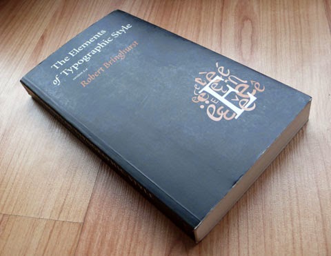
The Elements of Typographic Style
one of the best investments I can recommend when it come to learning typography is to purchase a copy of Robert Bringhurst’s Elements of Typographic Style (http://amzn.to/1itePlL)

For a lighter overview of typographic history and use take a look at Simon Garfield’s Just My Type (https://amzn.to/2yCVIck)
In Conclusion
Thank very much to all who attended my talk on UX & Typography
🗣 Many thanks to the folk at @Dot_York / @isotoma this evening for the opportunity to speak on two of my great interests—#typography and #UX—and many thanks to all those who attended the @Dot_York/@nuxuk 🔀 cross-over event ツ#DotYork #NUX
— Rob Whiting 📓 (@whitingx) 21 June 2018
It hopefully offered some useful tips that can be applied to general product design work.
If you’d like to discuss more, or have any questions in this area, I can often be found discussing this topic on-line.
https://twitter.com/search?q=typography+from%3Awhitingx
Thanks ツ