Colour Theory & Design Resources
27 Apr 2017A recent UXDiscuss event looking at the use of colour to enhance the users experience had me digging back through various resources I’ve gathered over time in relation to colour theory and UI design.
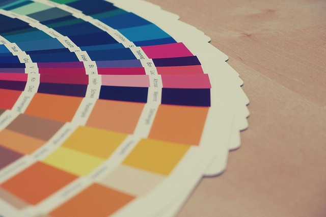
 Colour Swatches
This post is designed as a future reference and a way to collect these resources together.
⎆ An International Guide to the Use of Colour in Marketing & Advertising
⎆ Can text in different colors help you tackle the most difficult books?
⎆ Canva ‘Colors Design Wiki’—information about colors and their meanings
⎆ Everything About Color Contrast And Why You Should Rethink It
⎆ Handprint—Color harmony & color design
In regard to these ^ two—Basically everything listed here - http://www.handprint.com/LS/CVS/color.html) - is fairly useful ツ
⎆ How to Use Color in Design to Guide Your User
⎆ How To Use Color To Prove Your Point, From A Data Viz Expert
⎆ Practical Rules for Using Color in Charts
⎆ The key to color harmony: Avoiding boredom and chaos
⎆ The Psychology of Color in Marketing and Branding
⎆ The Semantics Of Color, Visualized
⎆ This 1939 Chart Explains How Color Affects Legibility
⎆ Web design color theory: how to create the right emotions with color in web design
⎆ Web UI Design for the Human Eye
⎆ We’re Only Just Beginning To Understand How Color Impacts Users
⎆ What your users really think about your choice of colors
⎆ Why Red Means Red in Almost Every Language
Hopefully these resource will prove useful when looking to learn about colour theory and the use of colour to enhance UX.