14 Sep 2015
A recent project involved the addition of a Feedback button across all pages of an enterprise system. This was to allow users to quickly & easily offer feedback & comments on any part of the system while remaining in their particular use flow. Any problems discovered could be highlighted to the development team with a simple button click which captured the reporters name, browser details, URL and their comment whilst not disrupting the user by having to stop what they are doing to report a problem or make a comment.
Making ‘New’ Features Stand Out
As a new feature I wanted this to stand out, to be noticed by people using the site who may experience UI ‘blindness’ and miss this important new functionality. To try and avoid this I designed the feedback UI to contrast with the system pages, to stand out and show off this new UI element to users.
 Feedback Button UI Element
And this worked well, perhaps too well, many of the early comments were how distracting this new feedback UI was but seeing as this was submitted using the new feedback system it did point towards its discoverability and intuitiveness.
‘Ageing’ the UI
However, once this initial highlighting had been in place, and generally users were made aware of this new feature and started to use it, the plan was always to rein the design in, have it sit more naturally within the rest of the system UI once users knew how to use the feedback system and offer comments.
To do this, I designed a range of styles to allow the feedback UI to naturally ‘age’ over time, to blend in more-and-more with the system UI.
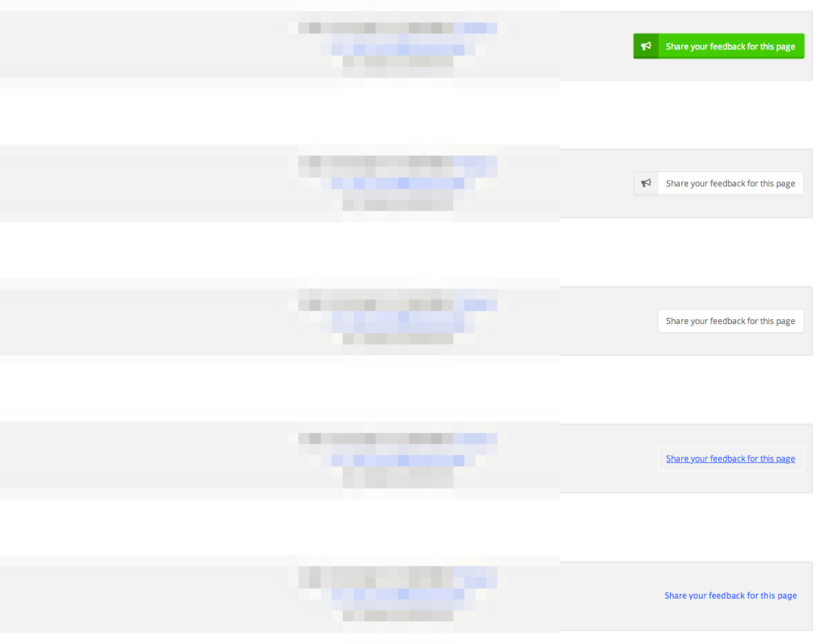 ‘Ageing’ Feedback Button UI Element
This is my first experiment at ‘ageing’ a UI in this manner so it will be interesting to see the results in naturally blending the interface over time.
Potential Issues
I’m unsure how this process will affect new users to the system, will they be able to as easily identify the ‘feedback’ UI compared to those who have seen it ‘age’ over time? One way around this would be to base the styling on longevity of use—new user would see the original, more striking UI which over time would normalise to the default one seen by longer-term users.
Conclusion
If this proves to be a successful UI change within the system it would be interesting to consider other areas where this ageing/graceful UI degradation might be useful.
09 Sep 2015
For quite a while now I’ve wanted to do more writing up of the work I’m doing and general thoughts I have on UX, interface design, typography & whatever else interests me at a given time.

I’ve worked through quite a few systems including Wordpress, Blogger, Textpattern but not found a system I felt really fitted in with how I’d like to work. I find myself getting hung up on the design, or plugins for including feeds or ads.
Minimum Viable Product Writing
The idea of creating a Minimum Viable Product is one that resonates with me as a UI designer. Working from sketches through to a finished product via various stages of fidelity has proved to be a technique that works for me. It made sense then to try this approach with my writing.
This new platform has been set up using Github Pages and (initially, but no longer) Tinypress. The articles are written using Markdown and hosted via Github https://github.com/whitingx/whitingx.github.io allowing others to make pull requests to suggest edits, ammend typos or suggest ideas for discussion. This even opens up the chance for me to have guest editors - got an idea for an article? Just let me know - https://github.com/whitingx/whitingx.github.io/issues.
I’ve been thinking a lot on ownership of content recently - useful as things like Medium are I do worry about sites, and subsequently links, disappearing (something spoken & written about in great detail by Jeremy Keith - https://adactio.com/articles/9004). The same with technology - I used to use Textpattern for writing up articles and, while it’s still around, it’s not looking like a platform with a future. I could see a similar fate with things like Wordpress and, as such, I’m trying to become less platform dependant.
I’m using Github Pages as free hosting for ElectronicPress but the underlying technology, Jekyll, Markdown, Git, are all open source making it (hopefully) easier to move in future if required while maintaining content, links, images, comments, etc.
I’m also hoping to become a better writer as part of this. I’m always keen to point out the benefits of having good copy and the useful tools available to improve writing on the web but this is an area I’m looking to get better at. Github Pages also helps with this as it versions the content. It gives me the chance to go back and easily edit previous articles as I improve my writing craft while also retaining the previous versions for me to refer, or roll back too.
The Future
I’m not sure how this will work out, but I do know I want to write up the work I’m doing, the ideas I have, etc. just for my own reference—and if this proves useful to others, all the better.
I’m planning to start with this Minimum Viable Writing platform and then expand it over time, adding comments, sorting out category pages, pulling in other useful info and I’d be really interested in any ideas other might have - https://github.com/whitingx/whitingx.github.io/issues.
09 Sep 2015
This has been one of my favourite Vimeo films since first seeing it a few years back. A poignant look at a declining trade.
“I’m searching for a sound that doesn’t exist. I dream of one day making an instrument with a single string which will sound a bit like a lute, harp and a piano all at once but with just one string, the purity of one single string.
La Mer de Pianos from Wriggles & Robins on Vimeo.
Short film about Marc Manceaux, the owner of the oldest piano shop in Paris.
Shot, produced and directed by Tom Wrigglesworth & Mathieu Cuvelier
www.wrigglesandrobins.com
www.mathieucuv.com
Graded by Luke Morrison at The Mill
Mixed by Jeff Smith at 750mph
Special thanks to Clare Sullivan at 750mph
09 Sep 2015
I help run a UX community on Slack. We have ~5000 members but make use of the free tier. This means that the community has a 10,000 message limit in place, once we reached that 10,000 anything new added pushes out one of the older posts.
Useful comments, useful links, jokes, insights, detailed explainations and in-depth analysis all lost like
Tears in the rain
The other Admins and I had a few discussions on this, how were we to keep this useful info, how could we capture it before Slack removed it and add it somewhere useful. We talked of archiving systems, Pinterest, moving to another system without the message limitations.
But then, in the course of these discussions, we had a thought—perhaps we don’t need to keep everything. Digital moves fast, what was gospel 6 months ago can be discredited in an instant so that
Nobody does it that way anymore.
What do we achieve by keeping a record of these old links? With ~5000 UX professionals as part of the community we have an ideal up-to-date crowdsourcing system. People do ask the same questions as they can’t always see what has been asked and people do give the same answers for the same reasons - but - this ensures that the questions & the answers provided are always the most relevant, the most well thought out, in-the-moment resources.
Storage is cheap these days but it’s worth thinking about why to archive information, why to keep resources - just because we can doesn’t always mean we should.
07 Sep 2015
InVision - http://www.invisionapp.com/ - is a great system for design discussion. The ability to quickly and easily create prototypes or just throw a quick sketch online for a distributed team to review & discuss has been a great addition to my UX workflow.
As well as a recent Material Design style update they have also recently been adding some useful features to move the system beyond basic design discussion and place it more to the centre of a complete design workflow. These features include mobile testing, Kanban style Workflow boards, mood & brand boards in their Boards feature & the soon to be added InSight & InBox.
InVision Boards
Working with the Spencer Group on a new internal, secure email system I was looking at ways to best discuss ideas with a remote team.
allowing me to keep all the discussion in one place in a system all the members of my remote team were used to using.
When designing systems and their associated processes I try to look at how others handle the same problems I might face as a way to gather new ideas or to avoid potential issues. In the past I’ve made use of various third-party systems such as Kippt, Google Drive & OneDrive to collect screenshots of design elements to share and discuss. The addition of InVision’s new Boards feature seemed a perfect alternative for these third-party systems, allowing me to keep all the discussion in one place in a system all the members of my remote team were used to using.
Competitor Analysis Board
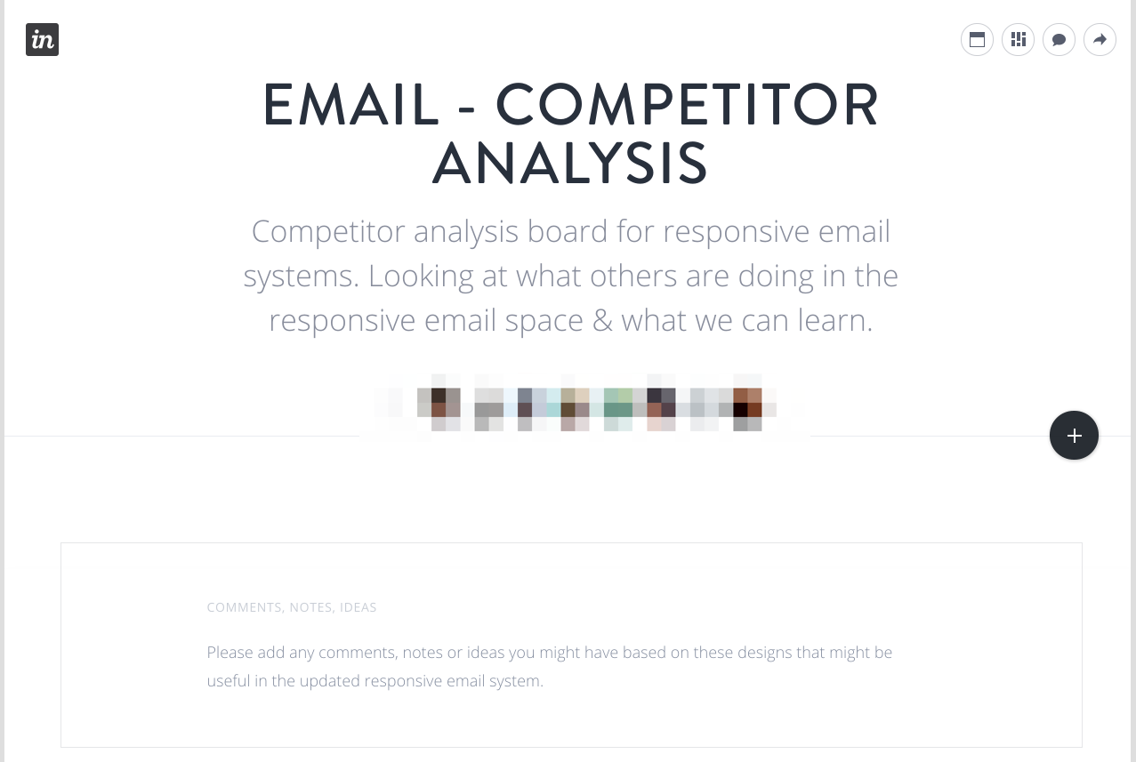
I set up a Competitor Analysis Board within InVision to conduct an assessment of the relative strengths or weaknesses of similar, email focused products.

This led with an explanation on how the team were using the Board to make it easy for anyone viewing for the first time to understand what they were looking at.
set a visual hierarchy within the page based on the number of comments an item had received.
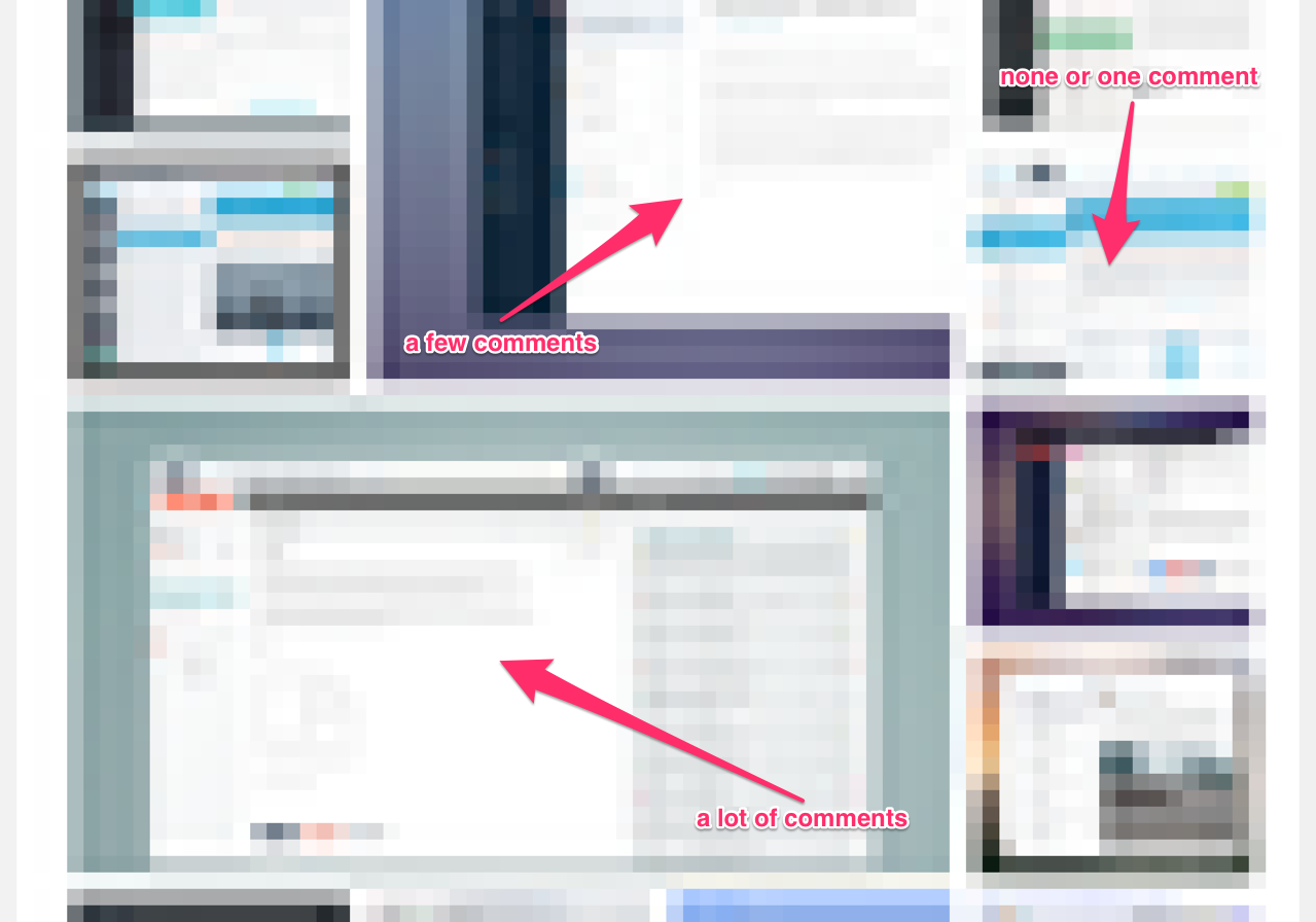
Any relevant designs, images, ideas & inspiration could then be added to the Board to allow for the remote team to add comments. I had the idea to make use of the scaling feature found within InVision Boards to set a visual hierarchy within the page based on the number of comments an item had received.
easy to see on viewing the page which items were generating the most discussion.
An item with none or a single comment remained at the default size, once the item had received more than one comment, it’s size was increased. This continued as more comments were added meaning that it was easy to see on viewing the page which items were generating the most discussion.

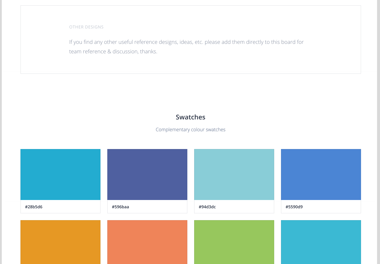
To finish up this collaborative resource, I then made it clear on the Board that all members of the remote team could add to the board any items they might want to discuss. We also used this Board to pull out relevant colour ideas for systems we thought made good use of complementary colour schemes, or who displayed good contrast for call-to-action buttons.

Conclusion
By making use of InVision’s new Boards feature - http://blog.invisionapp.com/boards-share-design-inspiration-assets/ - I was able to quickly develop a system to perform useful competitor analysis inside a design discussion framework already know to everyone on my remote team. While not specifically designed for this use, the flexibility InVision offers made it an ideal tool. Here’s hoping that the upcoming InVision updates mentioned above prove to be just as useful.
 Feedback Button UI Element
 ‘Ageing’ Feedback Button UI Element
