26 Apr 2013
With tools like Balsamiq being useful for lo-fi wireframing there is also the consideration of how you would like your fonts to display. Lorem Ipsum can be useful for test display of text but can also offer a layer of distraction to clients.
The default font in Balsamiq can be useful if your wireframes require actual text but to further abstract your wireframes down to a purely functional level the following fonts are available.
Blokk
http://blokkfont.com/
Described as
“…a font for quick mock-ups and wireframing for clients who do not understand latin.
 Blokk Font Across Various Devices
Redacted
https://github.com/christiannaths/Redacted-Font
From Christian Naths comes Redacted, described as a font to
“Keep your wireframes free of distracting Lorem Ipsum.
and available in various versions.
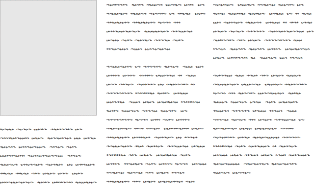 Redacted Script
Fillr
And finally there is Fillr from PowerMockup
https://www.powermockup.com/blog/fillr-wireframing-font
“… a free dummy font that replaces actual characters with squiggly lines (heavily inspired by BLOKK, which uses blocks instead). FILLR makes dummy content immediately identifiable without distracting anyone with fake Latin.
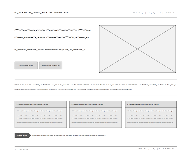 Fillr wireframe font
Hopefully these fonts will offer you useful options when creating your lo-fi wireframes.
Changing the default font in Balsamiq
Useful instructions on how to change the default font used in Balsamiq are also provided by SitePoint here - http://www.sitepoint.com/wireframing-balsamiq-mockups/
24 Apr 2013
An interesting look at improving experience for both drivers and pedestrians in the town of Poynton.
A useful real-world example of the UX benefits of removing elements rather then adding them.
References
A longer version of the above video can be found here - http://www.youtube.com/watch?v=-vzDDMzq7d0
23 Apr 2013
Working in UX I find good quality note/sketchbook is essential. Having something to hand that requires simply picking up and enables me to get ideas down in can really help my creative workflow.
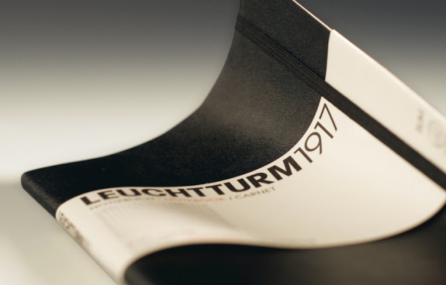
My seemingly never-ending quest for the ideal note/sketchbook led me to the Leuchtturm1917 A5 dotted softcover.
 © Leuchtturm1917
http://www.leuchtturm1917.com/en/content/softcover
My reasoning for this choice covered a range of factors.
- Dotted rather then squared - trying not to constrain myself to the grid based layouts squared paper notebooks seem to lead me to.
- Numbered pages with index- I’ve found this feature, not in Moleskine notebooks, invaluable for keeping track of different, concurrent project notes.
- Removable, perforated pages - allow for easy sharing of notes during workshops or a space for putting disposable ideas.
- Softcover, fold-able and lays flat - the hardback notebooks I’ve used in the past aren’t conducive to having open in front of me while working digitally, again this feels constraining to be either working on paper or on digital, I’m hoping that this feature will help merge my workflows.
- A5, more space then my usual A6 notebooks, opens out to A4 for scanning and copying.
I’ll be spending some time using the notebook and will try to put together a follow up review of how it worked in real world situations.
Now to search out the perfect pen.
14 Feb 2013
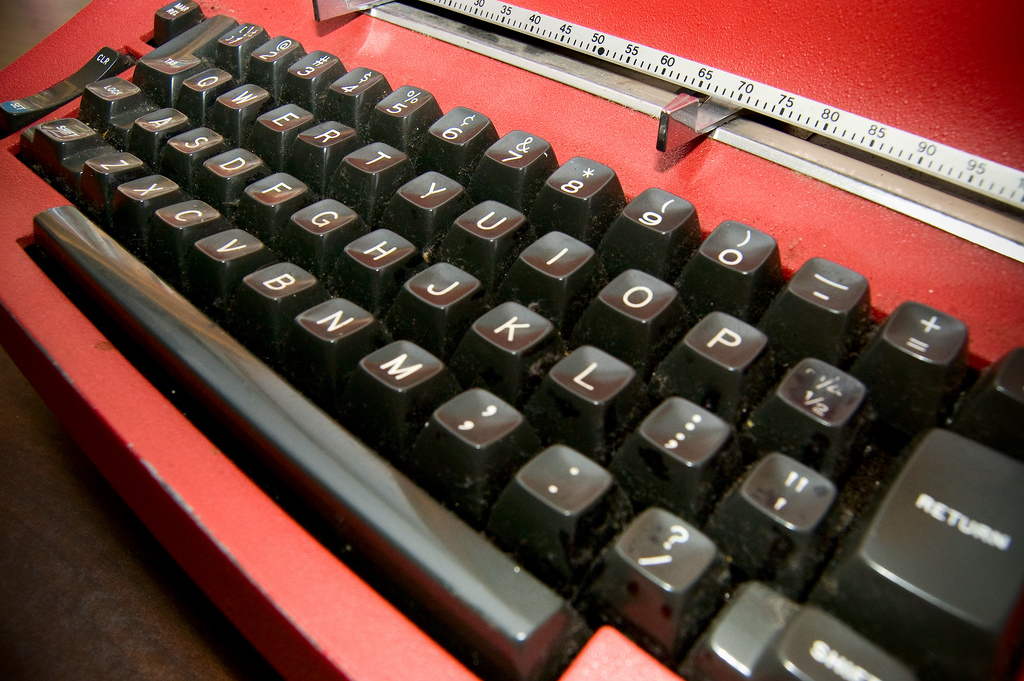
After reading a recent blog post - http://yovisto.blogspot.com/2013/02/christopher-latham-sholes-invented.html (via Harald Sack) - it raised some interesting points in regard to how the QWERTY layout used on keyboards came about.
“The problem with the arrangement was that the metal arms jammed into neighboring arms when pressed either at the same time or shortly after. Commonly used letter pairs were to be separated from each other, this way the speed of typing could also be increased. After years of rearranging the letters and numbers on the keyboard and the qwerty keyboard as we know it today was born.
 Image: Clint Gardner
So the QWERTY layout used today across a range of devices was designed to prevent the letter arms of the typewriter getting caught up, we no longer have this issue on modern day computer keyboards and touchscreen devices yet we still persist with this layout.
Other keyboard layouts suggested such as Dvorak - http://en.wikipedia.org/wiki/Dvorak_Simplified_Keyboard - are claimed by proponents to
“[use] less finger motion, increases typing rate, and reduces errors compared to the standard QWERTY keyboard. This reduction in finger distance traveled is claimed to permit faster rates of typing while reducing repetitive strain injuries.
but despite years of availability across various system the uptake has been low.
Users have a certain level of familiarity with certain UIs and this can be more productive in use then better optimised UIs that are less familiar.
05 Nov 2010
I was able to attend the Web Accessibility London 2010 Unconference held at the City University London on the 21st of September 2010.
 City University London
For a new event it was extremely well run by Makayla Lewis and the rest of the ‘A’ Team, they should all be rightfully proud and it would be great if this could become a yearly event.
Unconference Introduction
The Unconference kicked off with ‘What is Accessibility?’ presented by Graham Armfield and Makayla Lewis followed by Makayla’s presentation on ‘Online communication and users with motor impairments’. This was a fascinating look into a less covered area of web accessibility but one that definitely needs to be considered when looking at the accessibility of any website. As well as users with motor impairment many of the items discussed would also apply to older users of website and issues such as informing your users of what changes have been made to your site are universal.
Interaction Lab Tour
Due to the ‘Unconference’ nature of the event there were many things to take part in during the scheduled lunch break. It was a difficult decision to skip Martin Kliehm’s talk on HTML5 Accessibility but the chance to tour City University London Interaction Lab was too good to pass up.
Raj Arjan, the Interaction Lab manager, kindly showed a few groups around the Interaction Lab and answered questions. It was interesting to take a first hand look at a Microsoft Surface but the tight integration with Microsoft only products would appear to limit many of it’s potential uses. I believe that the use of open standards on these type of products is vital for future evolution and development.
Fix The Web
The afternoon sessions included a talk by Gail Bradbrook on the Fix the Web initiative.
This is a fantastic, almost Utopian idea of how the web can work;
- Disabled people report web accessibility problems in under a minute.
- Volunteers take these issues forwards with website owners—simple!
It seems like a fantastic idea but I’m unsure of how practical the system might be, there appeared to be no way of verifying how much the Fix The Web volunteers would know regarding accessibility and this might prove to cause more issues then it resolves. An interesting thread has been started regarding Fix The Web on Accessify Forum and is worth a read for more information. The people behind Fix The Web have been responsive to comments made and it’s great to see new ideas being tested out, good luck to them.
Open Accessibility
The next talk was by Steve Lee on Open Accessibility. This was a great talk highlighting a number of open source accessibility initiatives. Being involved in an open source project is a great help and learning experience for any business or individual. OSS Watch have a great primer on getting involved with Open Source projects.
The day finished with an Inclusive Design, Accessibility & Open Web Standards Panel featuring Ian Pouncey, Jim O’Donnell & Sandi Wassmer. This was a great forum for bouncing ideas off some of the experts.
Conclusion
This was a great event covering some very interesting, less widely regarded aspects of accessibility. If expanded on next year this will become an excellent resource.
Further Reading
 Blokk Font Across Various Devices
 Redacted Script
 Fillr wireframe font