From a 1960's Manual to a 2018 Design System
03 Oct 2018Second-hand book shop, junk shops, antiques centres. I’ve always enjoyed having a look over these types of place to draw what design inspiration I can from the items that can be found there.
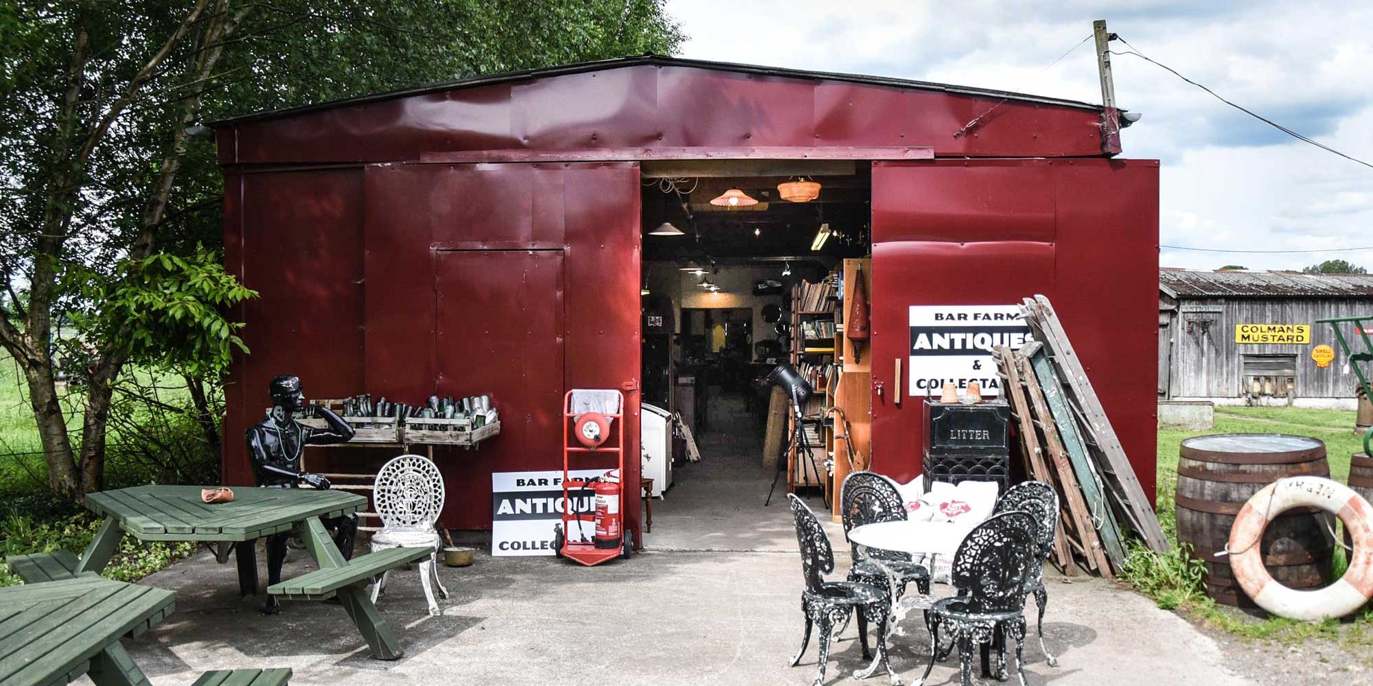
I must have passed Bar Farm Antiques - https://www.barfarmantiques.co.uk/ - dozens of time before finally deciding to stop off one day and have an explore.
 Bar Farm Antiques Centre - Front © 2018 BAR FARM ANTIQUES
It’s a fascinating place, well worth a look if you’re passing by. After looking through various areas (but not having a coffee in the converted bus café ツ) I came to this part of the centre.
 Bar Farm Antiques Centre © 2018 BAR FARM ANTIQUES
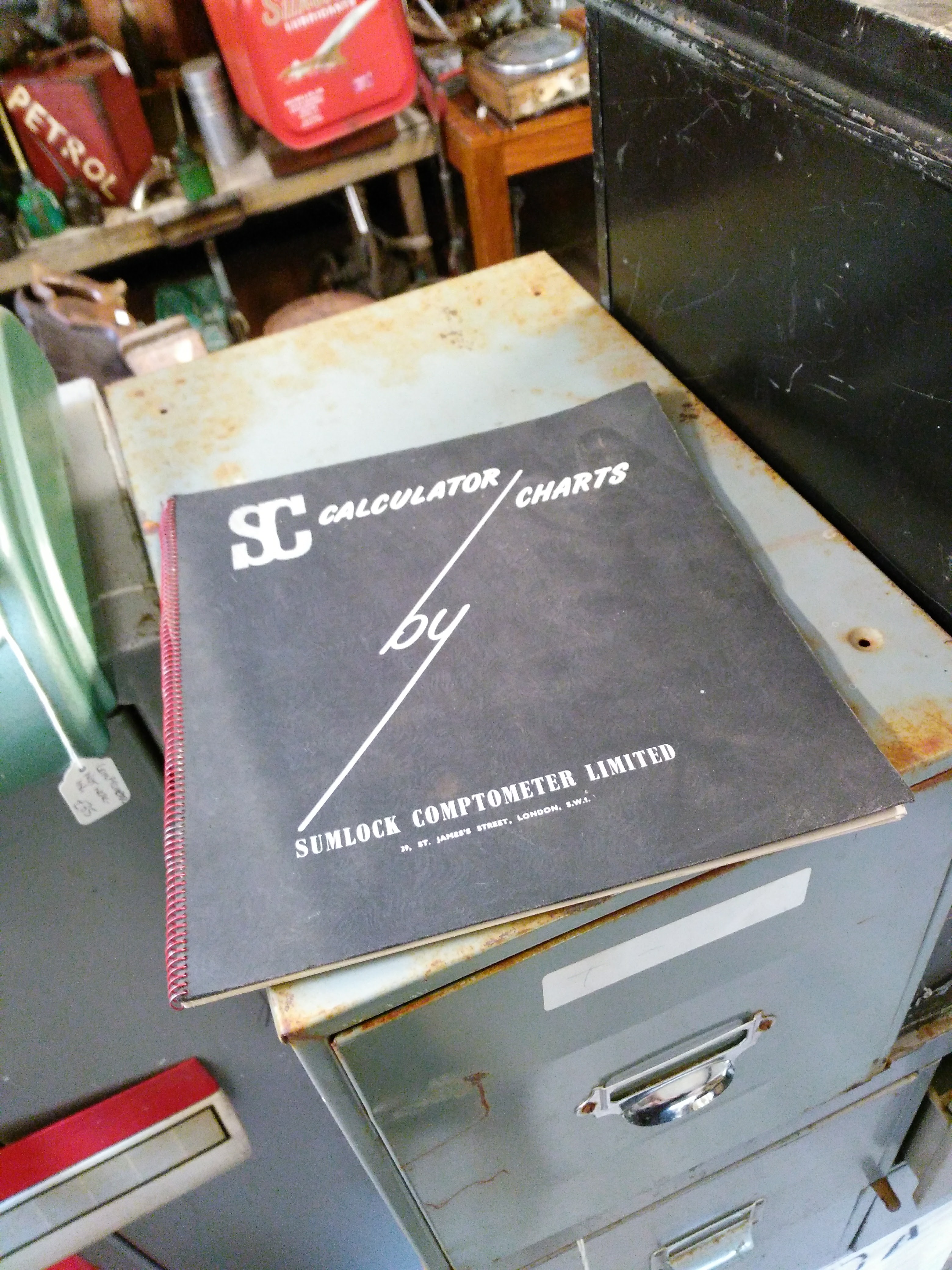
And taking a look through, found this excellent example of layout/formatting for tabular data. The cover alone was great (just look at that ‘By’)
 SC Calculator Charts Book - Cover
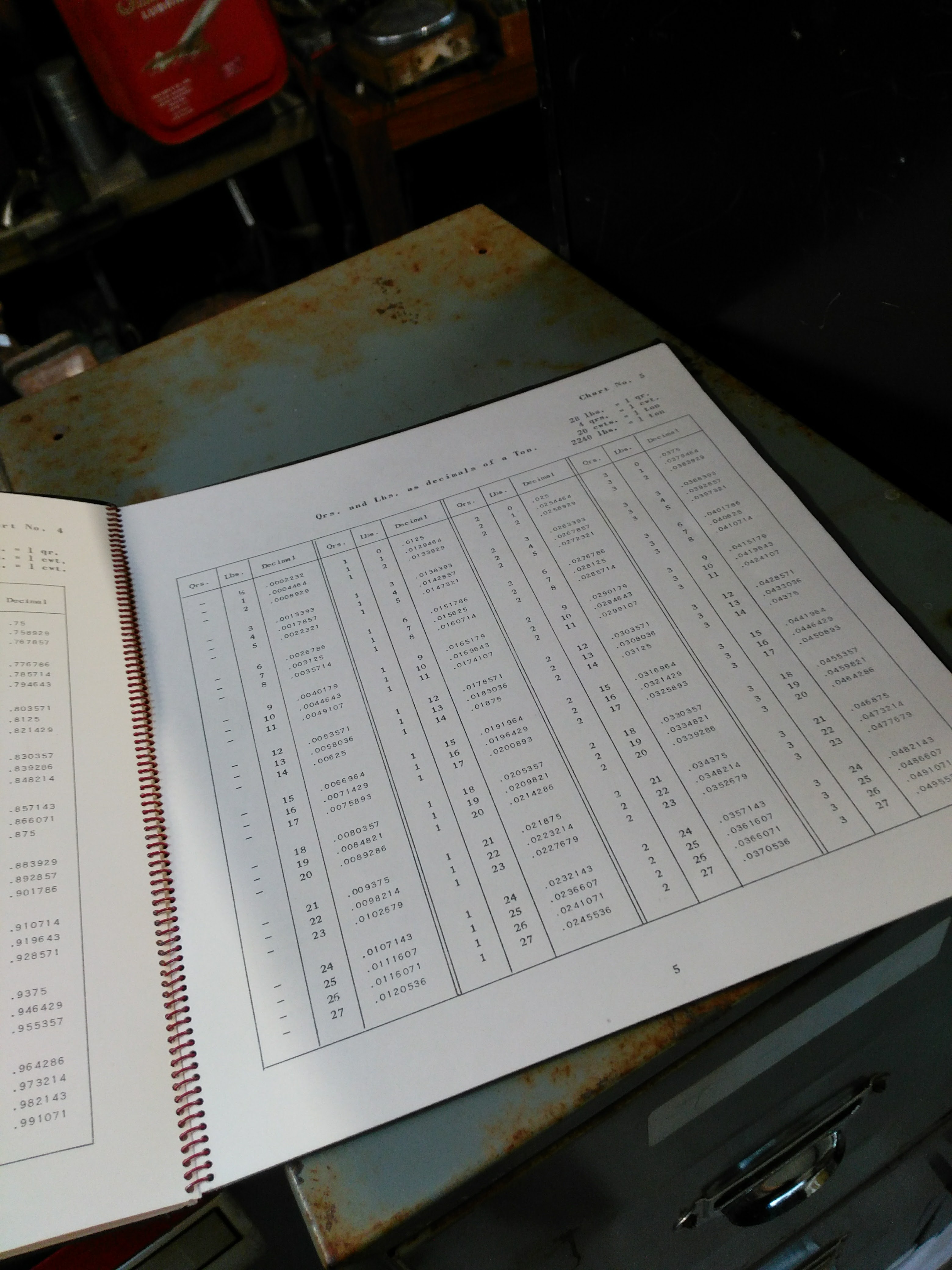
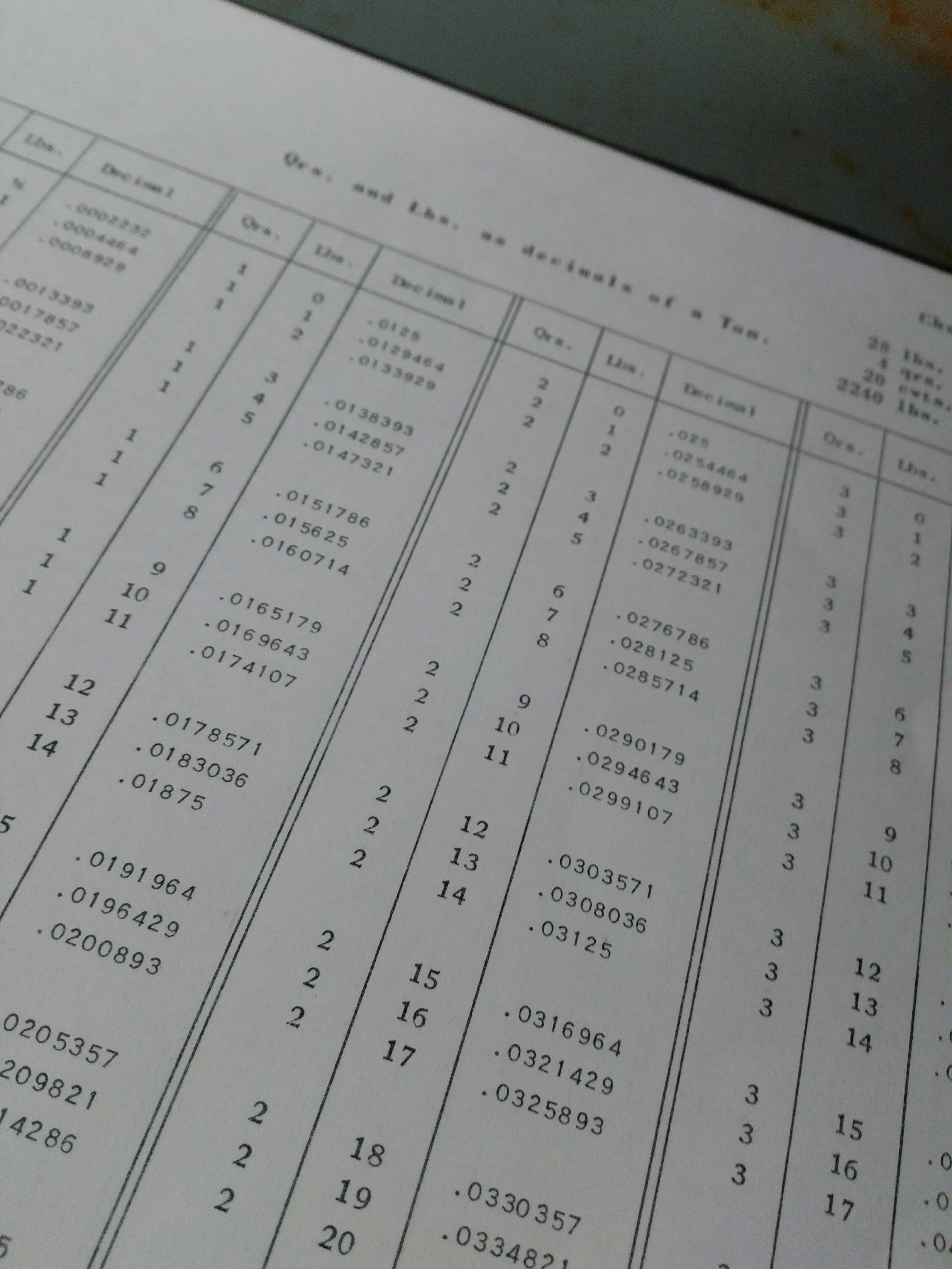
It got even better inside, clean layout, well structured & aligned data. I ended up using this as an example of data table layout for a Design System I was working on at the time.
 SC Calculator Charts Book - Inside
 SC Calculator Charts Book - Inside, close up
This layout wasn’t done by a famous designer, just someone asked to layout a Comptometer - http://anita-calculators.info/html/mechanical_calculators.html - guide in an office somewhere. But what they created back in ~1960s has cast a long shadow to the Design Systems of today. Take time to look at the work done by those who came before us in the quieter corners of design, there’s a lot we can learn there.