User Interface 'Ageing'
14 Sep 2015A recent project involved the addition of a Feedback button across all pages of an enterprise system. This was to allow users to quickly & easily offer feedback & comments on any part of the system while remaining in their particular use flow. Any problems discovered could be highlighted to the development team with a simple button click which captured the reporters name, browser details, URL and their comment whilst not disrupting the user by having to stop what they are doing to report a problem or make a comment.
Making ‘New’ Features Stand Out
As a new feature I wanted this to stand out, to be noticed by people using the site who may experience UI ‘blindness’ and miss this important new functionality. To try and avoid this I designed the feedback UI to contrast with the system pages, to stand out and show off this new UI element to users.
 Feedback Button UI Element
And this worked well, perhaps too well, many of the early comments were how distracting this new feedback UI was but seeing as this was submitted using the new feedback system it did point towards its discoverability and intuitiveness.
‘Ageing’ the UI
However, once this initial highlighting had been in place, and generally users were made aware of this new feature and started to use it, the plan was always to rein the design in, have it sit more naturally within the rest of the system UI once users knew how to use the feedback system and offer comments.
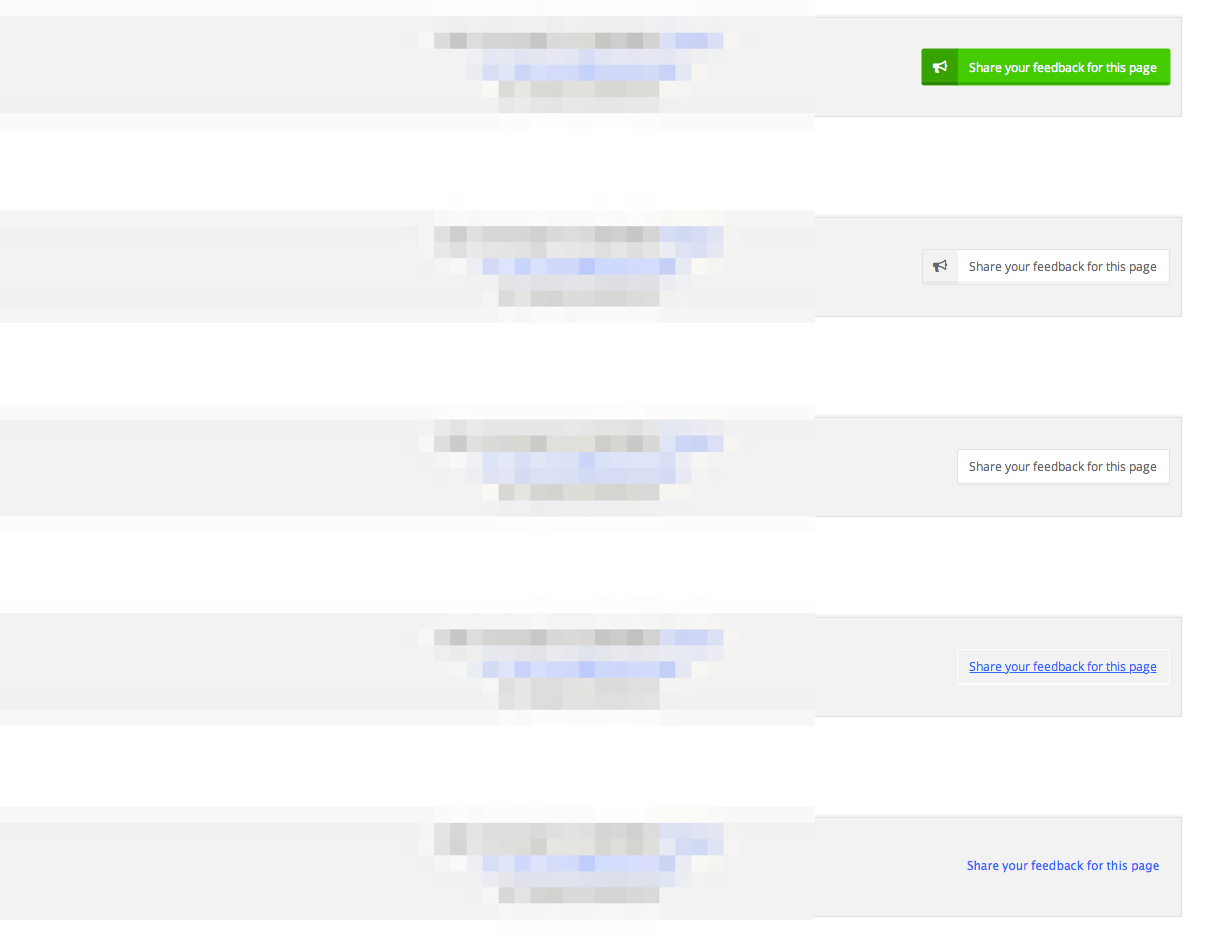
To do this, I designed a range of styles to allow the feedback UI to naturally ‘age’ over time, to blend in more-and-more with the system UI.
 ‘Ageing’ Feedback Button UI Element
This is my first experiment at ‘ageing’ a UI in this manner so it will be interesting to see the results in naturally blending the interface over time.
Potential Issues
I’m unsure how this process will affect new users to the system, will they be able to as easily identify the ‘feedback’ UI compared to those who have seen it ‘age’ over time? One way around this would be to base the styling on longevity of use—new user would see the original, more striking UI which over time would normalise to the default one seen by longer-term users.
Conclusion
If this proves to be a successful UI change within the system it would be interesting to consider other areas where this ageing/graceful UI degradation might be useful.